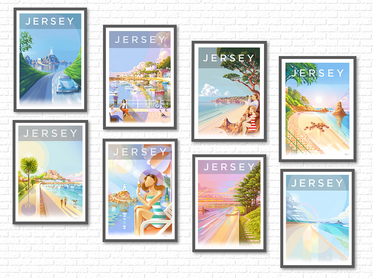
Local artist and designer Ron Mills talks about the artistic process and production of his series of retro/modern Jersey travel posters.
THE INFLUENCE
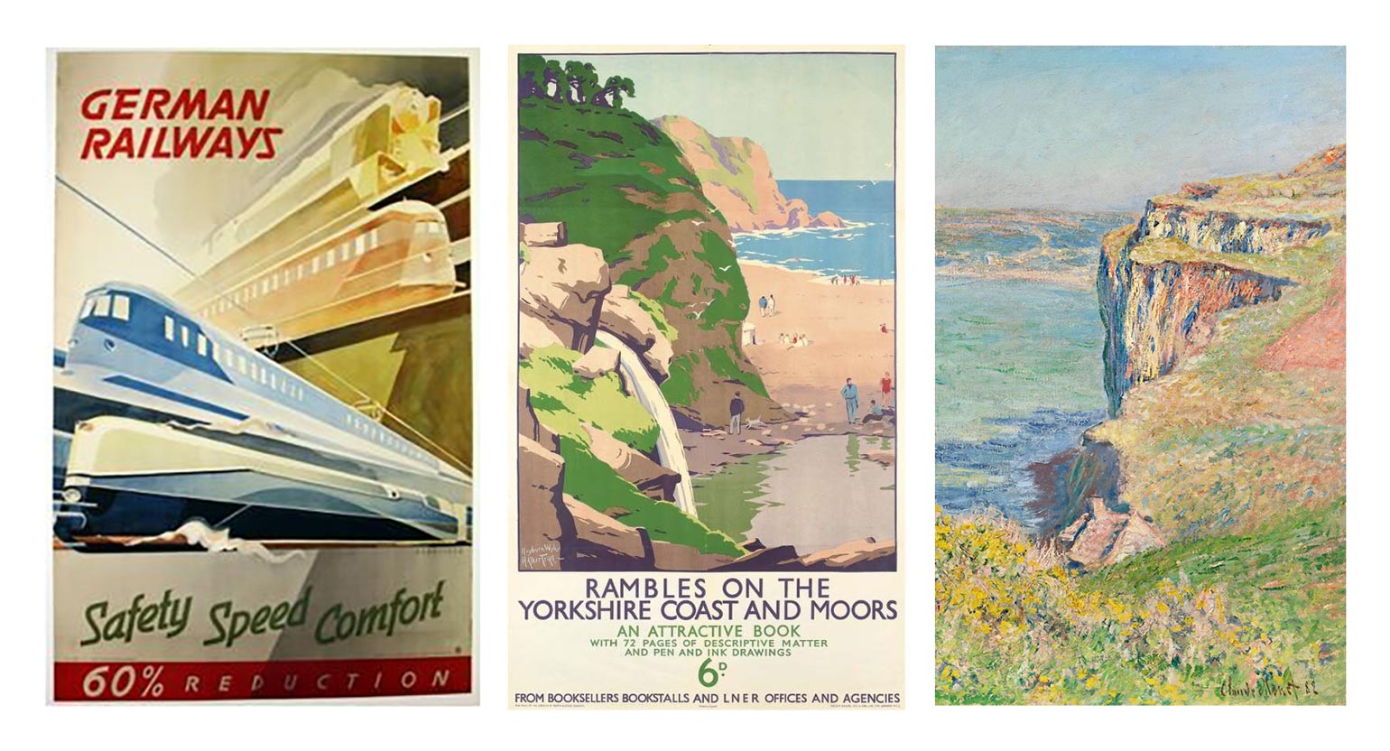
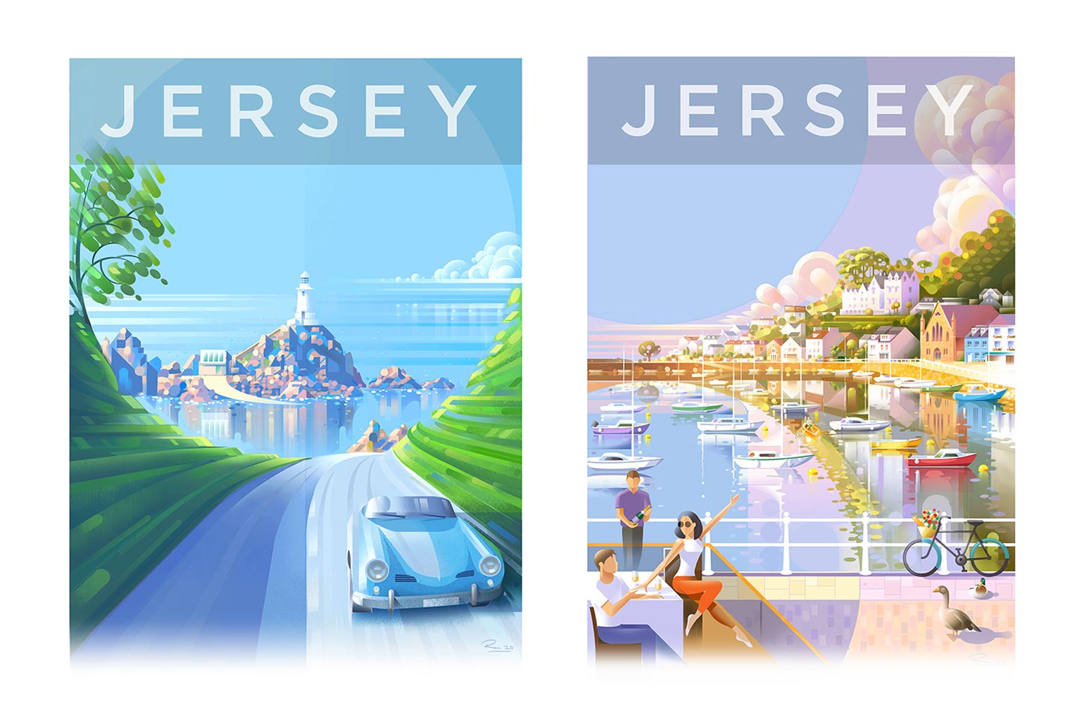
- As I mentioned, Art Deco is probably the main influence. This style from the 30s used bold geometric shapes to convey a sense of man-made modernity. In its heyday, it influenced the styling of architecture, planes, trains, cars and boats.
When I begin one of my posters I first try to design the scene using very few simple angles and shapes similar to the process of art deco design. Almost every element in my posters is constructed from either a circle, rectangle, square, oblong, or triangle. - Another big influence is 1940’s travel posters, especially the old British Rail ones. I particularly like the way they use flat bright blocks of colour to represent a scene in a minimal way. Restricting the amount of detail in these posters seems to capture the essence of a landscape in a simple modern way.
- One influence I have included that people don’t usually pick up on is French Impressionism, in particular the work of Claude Monet. I love the colour and brightness the impressionists gave their landscapes and I try to make the colours in my work, pop the same way.
During the colour sketching phase, I use similar colour techniques to produce an impressionistic effect.
For example, did you know that the impressionists rarely used the colour black? The reason was they believed the colour black didn’t exist in nature and preferred to use dark hues of colour to represent shadow and darkness. They also used short dabs of vivid colour to make an image sparkle.
THE ARTISTIC PROCESS
After deciding on the location of a poster, I go there and walk around for an afternoon just looking at it. What I am looking to portray is a simplified mental impression of the place rather than an accurate photographic representation of it. I deliberately don’t take a sketchbook or camera with me, as I seem to get better results working from memory.
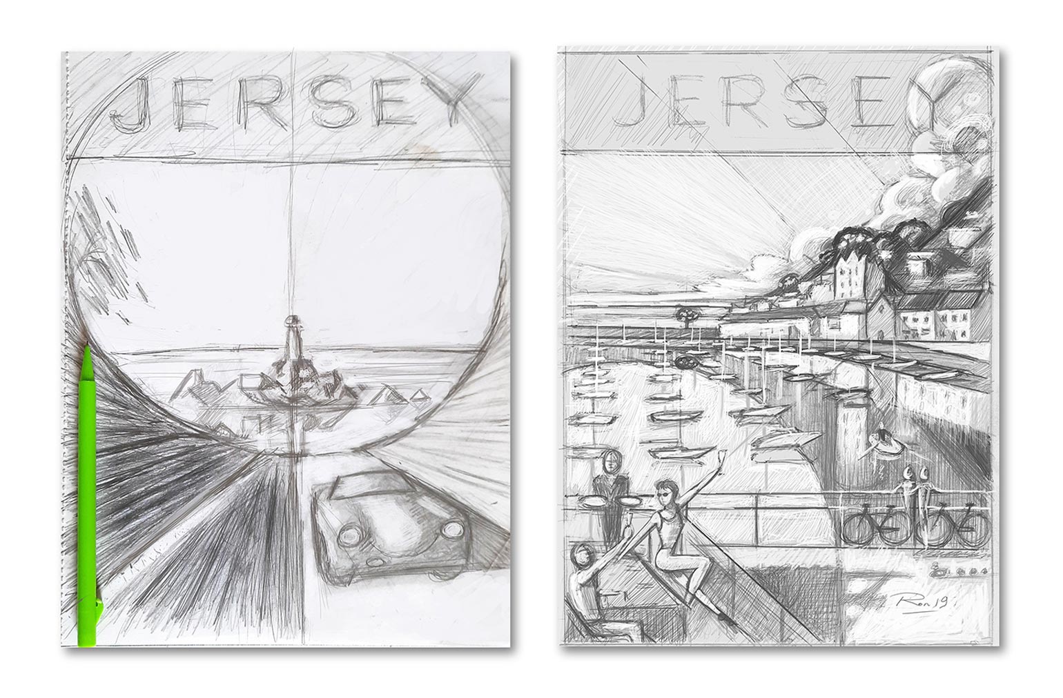
On my return home that evening I pour a glass of wine, put on some music, get relaxed and then reach for my sketchbook and pencil. When producing the composition of the poster I try and represent the scene as simple as possible using only a few lines and shapes. I probably do around fifty of these small simple sketches before being happy enough with the finished basic concept. Next comes the large finished pencil drawing, where I begin to work out the smaller details and shading.
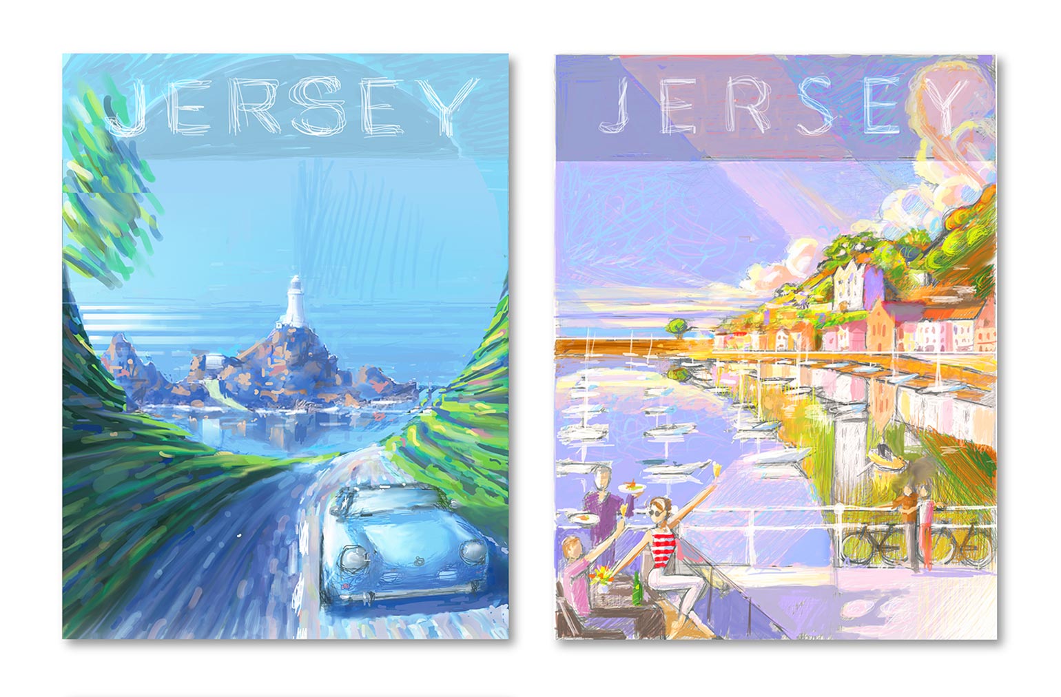
The next stage is the colour sketching. After transferring the pencil work onto my iMac I work on the colour sketches digitally. Originally, I hand-painted the colours using acrylic paints to work out the colour schemes of my posters. Lately, I’ve taken to digitally painting them on screen as this saves time. In my experience planning out the colours beforehand saves a lot of correction time in the long run. I tend to do these very quickly and roughly as these are simply a plan for my benefit and no-one ever sees them.
With the pencil and colour rough sketches complete, I place them in separate layers on an Adobe Illustrator file. I then begin working on the finished poster by drawing and building up layer upon layer of simple shapes on top of each other. I like to think of it as painting using building block shapes rather than brushes. This is a time-consuming process and uses hundreds of separate layers.
When the first draft of the artwork is complete, I often show it to a few friends for their comments and I’m receptive to suggestions from my online followers. The goal, after all, is to produce something that the audience will enjoy. I’m not so precious about my art that I won’t listen to constructive criticism. This is still a very new thing for me and I am thrilled that people like my posters enough to hang them up on their walls.
On completion, I send my work to John at Captured Dreams for printing. I frame the pictures myself and make a point of delivering each one personally. The greatest buzz I get from producing these posters is meeting the people who enjoy them and seeing the smile on their faces when I hand them over. I love producing iconic Jersey scenes in this style and will keep producing them as long as customers want them.
~
Purchase prints and discover more wonderful Jersey inspired Artwork by Ron Mills.
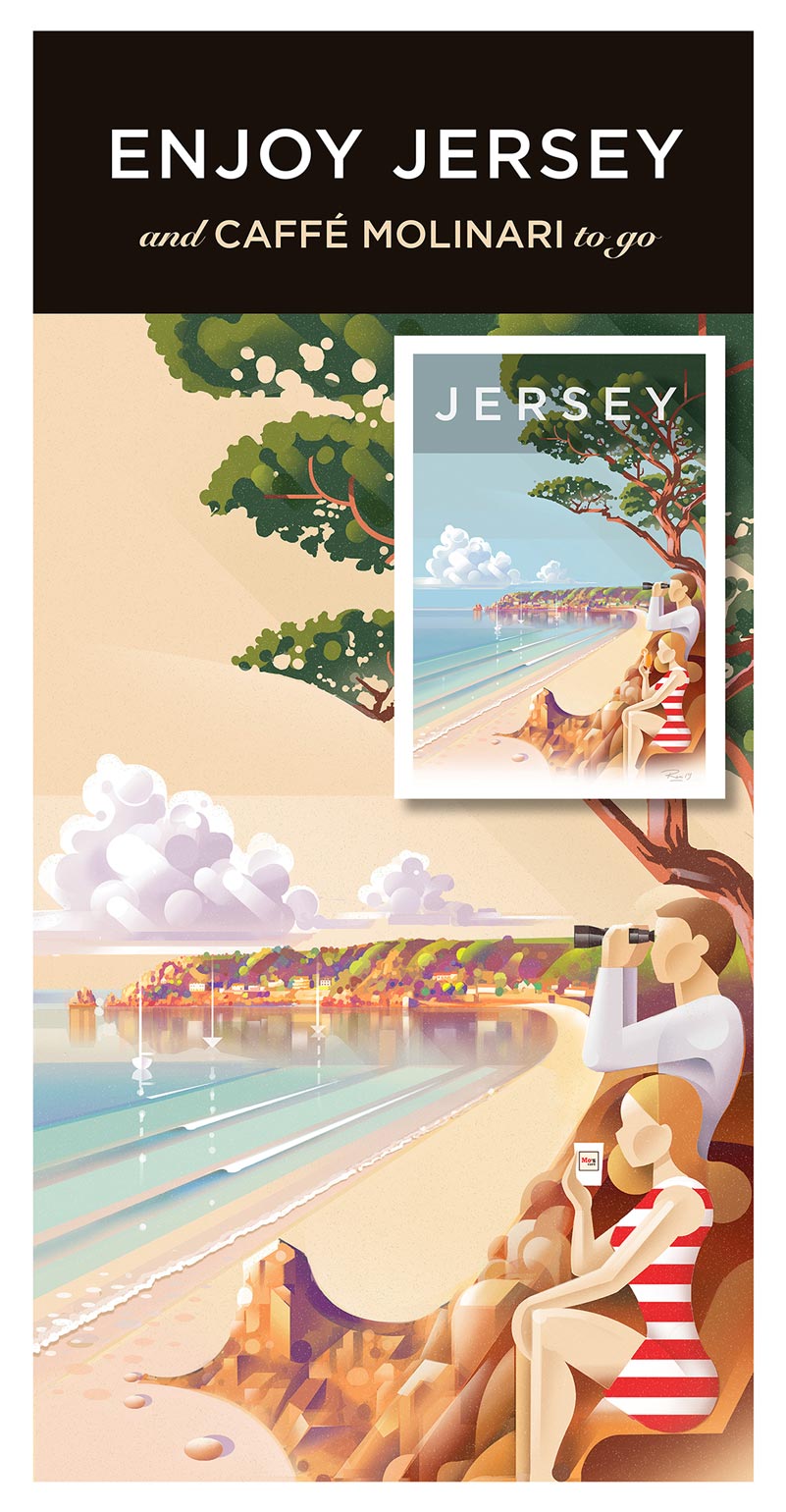
Win yourself a framed copy of Ron's "St Aubin" Jersey Travel Poster, as featured on the cover of the 2020/21 Jersey Directory, when you enter the JT Directory "Review to Reward" Challenge. Click the image below to enter, entries close Nov 30.